-
Natalia Agudelo
Prosesskartlegging fra et designperspektiv: Fem prinsipper for å utvikle det riktige kartet
I organisasjoner kan en prosess planlegges av én avdeling, godkjennes av en annen, utføres av en tredje og rapporteres av en fjerde. Ingen opplever den fra start til slutt; hver avdeling ser bare sin del. For å endre en prosess må designere gjøre hele bildet synlig for alle.
Denne fragmenteringen strekker seg på tvers av ulike systemer og lange tidslinjer – fra årsplaner til oppgjør som sluttføres måneder etter utførelse. Hver del føles komplett fra innsiden, men hvor du sitter i organisasjonen er med på å prege hvor dypt den forstås.
Folk som utfører de daglige oppgavene kjenner sin del i minste detalj, men hva som skjer i andre team på begge sider er kanskje verken tydelig eller synlig. Ledergrupper mister ofte de operative detaljene, helt til en prosess som involverer elleve team og syv systemer blir fremstilt som fire tekstbokser på et lysbilde.
Begge synsvinkler er presise og nyttige i det daglige arbeidet, men når hele prosessen skal oppdateres, er ingen av dem tilstrekkelig alene til å gi et godt beslutningsgrunnlag for hva som bør endres, eller hvordan.
Når vi som designere deltar i prosjekter som skal forbedre eller justere prosesser i organisasjoner, er et av våre første bidrag å sørge for at det relevante «landskapet» er synlig og forstått av alle berørte interessenter.
Hva vi bringer til bordet
Å gjøre flokete eller uhåndgripelige problemstillinger forståelige er en kjernekompetanse i designfaget, med en lang tradisjon og et bredt repertoar av metoder, fra brukerreiser og tjenestereiser (service blueprints) til systemkart. Fordi design ofte tar utgangspunkt i brukeropplevelsen, er tidslinjer og arbeidsflyter gjerne bygget rundt brukerhistorier. Andre fagdisipliner, som ledelse eller ingeniørfag, velger andre kart med ulikt fokus og annen logikk: Diagrammer over systemarkitektur beskriver IT-systemer og dataflyt, men utelater menneskelige handlinger og tidsperspektivet. Virksomhetskart for tverrfunksjonelle prosesser viser hvem som overleverer hva til hvem, men lar data og systemer forbli implisitte eller overfladisk beskrevet. Begge formater løser oppgaven de ble laget for, men de færreste klarer å holde mennesker, data, systemer og tid samlet i ett og samme bilde.
I arbeidet med endringsledelse og omstilling er prosesskart mer enn bare dokumentasjon. De fungerer som det Star og Griesemer definerte som grenseobjekter (boundary objects):
«Plastiske nok til at ulike grupper kan tilpasse dem til sine egne formål, men robuste nok til å bevare en felles identitet på tvers av dem, og dermed i stand til å fungere som et oversettelsesverktøy mellom mennesker som ser det samme problemet fra helt ulike ståsteder.»
(Star og Griesemer, 1989)
Kartene vi utvikler har klare formål: De skal forankre en felles situasjonsforståelse (enten målet er å kartlegge forbedringsområder eller å peke ut retningen når beslutninger allerede er tatt), legge til rette for samtaler på tvers av fagmiljøer, gi beslutningstakere et konkret referansepunkt, og fungere som et oppslagsverk etter at prosjektteamet er oppløst og prosjektet er avsluttet.
Robustheten er det vanskeligste å få til: Et kart som menneskene som utfører arbeidet ikke kjenner seg igjen i, vil aldri bli et felles referansepunkt. Derfor designer vi metodikken og leveransene våre for to ulike målgrupper samtidig: De vi intervjuer, som må kunne gjenkjenne sitt eget arbeid i sluttresultatet, og de som skal lese og bruke kartet i etterkant. Når vi samler inn data, tar vi alltid utgangspunkt i hva folk faktisk gjør i praksis, fremfor å kun lene oss på hva formelle prosedyrer sier skal skje.
Når vi strukturerer kartene, bruker vi abduktiv resonnering (fordi ingen enkeltkilde eller enkeltsamtale alene rommer helheten). Vi utforsker systematisk hvilke logikker og strukturer som best forklarer både helheten og delene, før vi tester og forankrer dem hos sentrale fagpersoner og nøkkelroller. Sist, men ikke minst, behandler vi form som mening: Layout, struktur, informasjonsarkitektur, typografi og ikonografi avgjør hva leseren oppdager, fester seg ved og konkluderer med.
Fem prinsipper for å forme et prosesskart
Halogen har jobbet med endringsprosesser i store organisasjoner i mange år, og ingen enkelt logikk eller fast mal overlever møtet med virkeligheten i alle organisasjoner. Det vi har kommet frem til, er derfor ikke en mal, men et sett med prinsipper for hvordan vi tenker rundt slike kart. Disse veileder valgene vi tar når vi samler inn innsikt, forstår materialet og utvikler kartene i iterasjoner sammen med både de som utfører oppgavene og de som skal bruke informasjonen:
Rød tråd: Finn det som binder sammen på tvers av grensene. Hva er den bærende logikken resten av kartet skal følge? I en enkeltstående, sammenhengende prosess på tvers av mange team og systemer er det ofte datareisen som utgjør denne logikken. Når flere prosesser løper parallelt, er det gjerne tidsaksen. Når flere team sammen skal definere en helt ny prosess, kan et plausibelt fremtidsscenario være den samlende tråden.
Historie: Beskriv et representativt tilfelle du kan forsvare, og vær eksplisitt om hva som utelates. På samme måte som med brukere har prosesser sine avvik, varianter og særordninger. Vi velger bevisst hva vi skal beskrive, begrunner hvorfor, og markerer så langt det lar seg gjøre hva de utelatte tilfellene betyr for prosjektet som helhet.
Omfang: Start før «start», og slutt etter «slutt». Prosesser formes ofte av beslutninger og forutsetninger som legges lenge før arbeidet formelt starter (som kontraktsvilkår, systemkrav og planleggingspremisser), og de skaper konsekvenser som kanskje først viser seg lenge etterpå. Vi passer på at kartene våre inneholder nok informasjon til å gi en tydelig forståelse av årsaker og virkninger som er relevante for det aktuelle prosjektet.
Detaljnivå: Velg oppløsning med leseren i tankene. Fire overordnede steg er sjelden nok til å forstå situasjonen, mens førti delsteg drukner oversikten i støy. Vi bygger et hierarki som støtter riktig forståelsesnivå: Delprosesser, hovedsteg, aktiviteter og handlinger. Hvert nivå kan beskrives med en detaljgrad tilpasset prosjektet.
Design: Utform kartet ut fra hvordan det faktisk skal brukes. Et kart som skal lede diskusjoner i en workshop eller henge på en prosjektvegg, fungerer best som én stor, sammenhengende flate. Skal kartet derimot leses selvstendig på en bærbar PC, må layout og detaljnivå tilpasses vanlige skjermflater og normal lesbarhet. Prosesskart lever ofte lenger enn selve prosjektet; derfor må formål, avgrensning og dato for oppdatering fremgå umiddelbart. Vi tar høyde for at folk i organisasjonen har ulik fagbakgrunn, og at kartet vil bli brukt i situasjoner vi ikke forutså da vi tegnet det. Designgrepene velges deretter.
Hvordan ser dette ut i praksis?
De tre eksemplene under viser hvordan vi tenker og arbeider.
I. Én prosess, ende-til-ende (2024)

Illustrasjon 1: En sammenhengende flyt på tvers av ulike avdelinger og systemer.
Denne kartleggingen ble gjennomført som del av en prosessomstilling som berørte flere team langs verdistrømmen, og som krevde tilpasninger i IT-infrastrukturen. Prosjektet var samtidig definert som en mulighet til å gjennomgå arbeidsformer på tvers av menneske, teknologi og organisasjon (MTO), samt skape forankring og felles retning på tvers av miljøene.
Kartet i illustrasjonen over var den endelige versjonen som beskrev endringene i prosesser, aktiviteter og systemer som måtte til for å innføre den nye rutinen. Tidligere utkast med tilsvarende struktur ble brukt til å dokumentere dagens situasjon (as-is), kartlegge flaskehalser i verdikjedens arbeidsform og fange opp parallelle forbedringsinitiativer.
Prinsipper i praksis:
1 og 3. Rød tråd og omfang: Dataflyten fra planlegging til faktura. Behovet var tydelig fra start: Teamene langs verdikjeden manglet en felles situasjonsforståelse av hvordan prosessen hang sammen fra start til mål. Siden et av målene var å vurdere hvor godt systemene støttet den nye prosessen, ble det naturlig å la datareisen og systemene styre den røde tråden.
2 og 4. Historie og detaljnivå: Et representativt gjennomsnittstilfelle. Vi valgte et typisk standardtilfelle som alle teamene kjente seg igjen i. Hovedstegene beskrev kritiske punkter der data ble opprettet eller justert. Hvert spor i kartet representerte et team, og under oppgavene teamet utførte, viste kartet hva som skjedde med dataene og i hvilket system operasjonen fant sted.
5. Design: En tilpasset tjenestereise-struktur med detaljerte dataflyter. Alle kartene i dette prosjektet startet med å gi leseren kontekst: Helt til venstre ble det forklart hva kartet omhandlet, når det sist ble oppdatert, og hva som var særtrekkene ved produktet. Vi gjorde to sentrale tilpasninger i den klassiske tjenestereisen (service blueprint): Vi ga hvert team et eget spor i kartet, slik at overleveringene ble lett synlige, og vi prioriterte system- og dataflyten ved å etablere en fargekoding for systemer og for manuelle kontra automatiserte dataoverføringer på tvers av alle kartversjoner.
II. Flere prosesser, én felles kalender (2026)
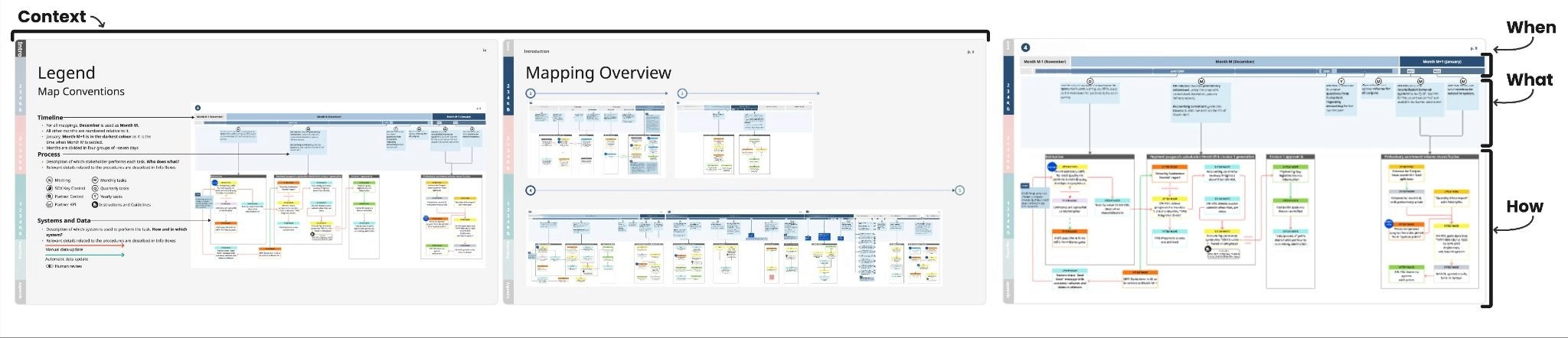
Illustrasjon 2: Utvalgte sider fra et dokument som presenterer parallelle flyter, utført av ulike enheter i ulike systemer.
Dette arbeidet ble gjort i et nytt prosjekt innenfor samme virksomhetsområde som forrige eksempel, men omfattet tre ulike produkter. Målet var å etablere en helhetlig oversikt over nåsituasjonen i forkant av en omstilling som ville påvirke tre verdikjeder med ulik arbeidspraksis. Forskjellen fra det første tilfellet lå i omfang og rekkevidde: Flere interessenter måtte forstå landskapet, og tyngdepunktet ble flyttet mot de avsluttende leddene i verdikjeden.
Prinsipper i praksis:
1. Rød tråd: Kalenderen. Data var fremdeles viktig, men å følge en enkelt sak ville ikke gitt innsikt i de senere stegene, der mange saker ble aggregert og behandlet samlet. Fellesnevneren for alle prosessene på tvers av produktene var den faste oppmerksomheten rundt gjeldende måned, månedsslutt, kvartalsavslutning og årsoppgjør. Desember ble derfor valgt som fast referansepunkt.
2, 3 og 4. Historie, omfang og detaljnivå: Den vanligste kategorien for hvert produkt, beskrevet med ulik oppløsning. For hvert produkt ble transaksjonene samlet i faste kategorier mot slutten av flyten. Vi valgte å beskrive kategorien flest involverte forholdt seg til. Vi dokumenterte de parallelle prosessene som genererte de samme dataene, og brukte disse som referanse for hva en endring ville innebære. Samtidig ble ikke alle prosesser beskrevet like inngående: Siden endringsbehovet lå i de sene fasene, ble disse kartlagt i mer detalj.
5. Design: Optimalisert for selvstendig lesbarhet på dataskjerm. Vi visste at dette kartet skulle brukes av fagfolk og ledere som leste det på egen hånd. Skjermformat og god lesbarhet ble derfor styrende premisser for utformingen. Da kalendermåneden ble den samlende tidsaksen på tvers av prosessene, erstattet vi de tradisjonelle team-radene med to tydelige informasjonslag: Hvem som utførte oppgaven, og hvordan dataene beveget seg i systemene. Vi videreførte fargekodene for IT-systemer og dataflyt fra forrige prosjekt for å sikre gjenkjennelighet i organisasjonen. Kartet åpnet med en kort veiledning til oppbygging og systemomfang, støttet av en fast navigasjonslinje.
III. En prosess under utforming (2025)

Illustrasjon 3: En plausibel verdikjede med parallelle tekniske, kommersielle, operative og rapporteringsmessige flyter, usikkerheter og avhengigheter.
Denne kartleggingen ble utført i et prosjekt som skulle vurdere om eksisterende kommersielle forretningssystemer og rutiner var egnet for en helt ny type leveransemodell. To alternative modeller ble utredet i parallelle spor av to ulike team.
Prinsipper i praksis:
1 og 2. Rød tråd og historie: Et plausibelt fremtidsscenario. Gjennom samtaler med fagpersoner på tvers av miljøene ble det tydelig at strategiske veivalg utenfor vårt prosjektmandat påvirket vurderingene direkte. Det var også åpenbart at uten et felles fremtidsbilde snakket teamene forbi hverandre. Vi tegnet derfor opp en plausibel, fremtidig ende-til-ende-verdikjede der vi stilte de to alternativene opp mot hverandre, for å gi de tverrfaglige samtalene et konkret fundament.
3, 4 og 5. Omfang, detaljnivå og design: Driftsmodellen i 2030, fra kontrakt til faktura. Kontekstseksjonen i kartet forklarte hvorfor et fremtidsbilde var relevant for arbeidet, og etablerte de tre hovedområdene som ville påvirke hele eller deler av den nye modellen: Rammebetingelser, operasjonell drift og inntektsstyring. Logikken ble valgt for å sikre full ende-til-ende-innsikt. Fagsporene i kartet representerte de sentrale funksjonelle strømmene som påvirket sluttleveransen: Teknisk, kommersiell, operativ og rapportering. Hvert steg i flyten inneholdt tre faste elementer: Hva som krevdes for å utføre oppgaven, erfaringer fra lignende prosesser i organisasjonen, og kritiske usikkerhetsmomenter som ville påvirke den fremtidige driften.
Oppsummering
Når et omstillings- eller forbedringsprosjekt spenner over mange team og systemer, møter man nesten alltid fragmentert informasjon, ulik detaljgrad og sprikende oppfatninger om fremtiden. Et felles prosesskart gir disse fragmentene en felles møteplass, og gir organisasjonen den nødvendige situasjonsforståelsen til å ta gode beslutninger om veien videre.
Uenigheter vil det alltid være, og den friksjonen er verdifull for prosjektet. Men med en felles situasjonsforståelse blir diskusjonene konkrete og forankret i virkeligheten. Det er da flokene lar seg løse.
Ta gjerne kontakt dersom du ønsker å diskutere hvordan vår tilnærming til prosesskartlegging kan støtte ditt prosjekt.

Natalia Agudelo
Senior designer
natalia.agudelo@halogen.no